
基于EasyX图形库实现简单的UI控件(一)

2025-3-22 ~ 2025-3-23
(0)
说明
以下是一个基于 EasyX 图形库实现的可复用、组件化的 UI 控件示例,尽量符合“高内聚,低耦合”的设计原则。本例中,实现了 3 个简单的类:控件的基类 UIBase、标签类 Label、按钮类 Button。使用创建的类 Label 和类 Button 创建的一个演示实例——点击按钮并显示点击次数。本例中的代码使用了较为详尽的注释来说明代码的作用,因此不再另行赘述每个代码的功能。
源码
本例共 7 个代码文件,其中主函数单独一个文件,3 个类每个类各 2 个文件。
本例使用 Visual Studio 2022 集成开发环境开发。
(1)main.cpp
// main.cpp : 定义应用程序的入口点。
#include <windows.h>
#include <graphics.h>
#include <vector>
#include <memory>
#include "Button.h"
#include "Label.h"

/**
 * @brief 主函数(相当于 Console 应用的 main() 函数,有些版本 Windows 会显示多余的黑色控制台,所以创建的 Windows 桌面应用项目)
 * @param hInstance 当前实例句柄
 * @param hPrevInstance 前一个实例句柄(已废弃,通常为 NULL)
 * @param lpCmdLine 命令行参数
 * @param 窗口显示方式(如最大化、最小化)
 * @return 返回值为 0 代表程序正常运行结束
 */
int WINAPI WinMain(
	HINSTANCE hInstance,
	HINSTANCE hPrevInstance,
	LPSTR lpCmdLine,
	int nCmdShow
)
{
	initgraph(800, 600);
	setbkcolor(WHITE);
	cleardevice();
	BeginBatchDraw();

	std::vector<std::unique_ptr<UIBase>> controls;
	int clickCount = 0;		// 点击计数器

	// 创建标签(先创建以便按钮可以访问)
	auto label = std::make_unique<Label>(350, 200, L"点击次数:0");
	Label* pLabel = label.get();	// 获取原始指针
	label->SetTextColor(BLUE);

	// 创建按钮
	auto btn = std::make_unique<Button>(300, 250, 200, 50, L"点击我");
	btn->SetColors(RGB(100, 150, 200), RGB(80, 130, 180), RGB(60, 110, 160));
	btn->SetOnClick([pLabel, &clickCount]
		{
			// 捕获 Label 指针和计数器
			clickCount++;
			pLabel->SetText(L"点击次数:" + std::to_wstring(clickCount));
		});

	// 注意添加顺序会影响绘制层级
	controls.push_back(std::move(label));	// 先添加 label 保证在按钮下层
	controls.push_back(std::move(btn));

	while (true)
	{
		cleardevice();

		// 处理鼠标消息
		while (MouseHit())
		{
			MOUSEMSG msg = GetMouseMsg();
			for (auto& control : controls)
			{
				control->Update(msg);
			}
		}

		// 绘制所有控件
		for (auto& control : controls)
		{
			control->Draw();
		}

		FlushBatchDraw();
		Sleep(10);
	}

	EndBatchDraw();
	closegraph();
	return 0;
}
(2)UIBase.h
// UIBase.h
#pragma once
#include <graphics.h>

/**
 * @brief UI 控件基类(抽象类),定义所有 UI 控件的通用属性和行为
 *
 * 实现坐标系管理、可见性控制、点击区域检测等基础功能,
 * 采用 NVI 模式(Non - Virtual Interface)提供模板方法框架
 */
class UIBase
{
protected:
	int x;					// 控件左上角 X 坐标(像素)
	int y;					// 控件左上角 Y 坐标(像素)
	int width;				// 控件宽度(像素)
	int height;				// 控件高度(像素)
	bool visible = true;	// 可见性状态(默认可见)

public:
	/**
	 * @brief 构造函数初始化控件基础属性
	 * @param x 左上角 X 坐标
	 * @param y 左上角 Y 坐标
	 * @param width 初始宽度
	 * @param height 初始高度
	 */
	UIBase(int x, int y, int width, int height);

	/**
	 * @brief 虚析构函数保证派生类正确释放资源
	 */
	virtual ~UIBase() = default;

	/**
	 * @brief 纯虚函数-绘制控件到渲染目标
	 * @note 派生类必须实现具体绘制逻辑
	 * @warning 应在图形环境初始化后调用
	 */
	virtual void Draw() const = 0;

	/**
	 * @brief 纯虚函数-处理鼠标消息
	 * @param msg 鼠标消息结构体
	 * @note 派生类根据需求实现交互逻辑,无需处理时可空实现
	 */
	virtual void Update(const MOUSEMSG& msg) = 0;

	/**
	 * @brief 设置控件位置(左上角坐标)
	 * @param x 新 X 坐标
	 * @param y 新 Y 坐标
	 * @note 立即生效,下次绘制时更新
	 */
	void SetPosition(int x, int y);

	/**
	 * @brief 设置控件尺寸
	 * @param width 新宽度(>0)
	 * @param height 新高度(>0)
	 * @warning 非法尺寸会导致绘制异常
	 */
	void SetSize(int width, int height);

	/**
	 * @brief 设置控件可见性
	 * @param visible true 可见 / false 隐藏
	 * @note 隐藏的控件不参与绘制和交互
	 */
	void SetVisible(bool visible);

	/**
	 * @brief 获取当前可见性状态
	 * @return true 可见 / false 隐藏
	 */
	bool IsVisible() const;

	/**
	 * @brief 检测坐标是否在控件区域内
	 * @param px 检测点 X 坐标
	 * @param py 检测点 Y 坐标
	 * @return true 在区域内 / false 在区域外
	 * @note 基于当前控件位置和尺寸计算
	 */
	bool Contains(int px, int py) const;
};
(3)UIBase.cpp
// UIBase.cpp
#include "UIBase.h"

/**
 * @brief 初始化基础属性构造函数
 * @param x, y 初始坐标位置
 * @param width, height 初始控件尺寸
 */
UIBase::UIBase(int x, int y, int w, int h) : x(x), y(y), width(w), height(h)
{
}

/**
 * @brief 更新控件坐标位置
 * @param x, y 新的左上角坐标
 */
void UIBase::SetPosition(int x, int y)
{
	this->x = x;
	this->y = y;
}

/**
 * @brief 设置控件新尺寸
 * @param w 新宽度(需>0)
 * @param h 新高度(需>0)
 */
void UIBase::SetSize(int w, int h)
{
	width = w;
	height = h;
}

/**
 * @brief 设置可见性状态
 * @param visible 新的可见性标志
 */
void UIBase::SetVisible(bool visible)
{
	this->visible = visible;
}

/**
 * @brief 获取当前可见性状态
 * @return 当前是否可见
 */
bool UIBase::IsVisible() const
{
	return visible;
}

/**
 * @brief 碰撞检测算法
 * @param px, py 待检测点坐标
 * @return 是否在矩形区域内
 *
 * 检测公式:(px >= x) && (px <= x + width) && (py >= y) && (py <= y + height)
 */
bool UIBase::Contains(int px, int py) const
{
	return px >= x && px <= x + width && py >= y && py <= y + height;
}
(4)Label.h
// Label.h
#pragma once
#include "UIBase.h"
#include <string>

/**
 * @brief 文本标签控件类,继承自 UIBase,实现静态文本显示功能
 *
 * 支持透明背景、动态文本更新和颜色配置,自动根据文本内容调整控件尺寸
 */
class Label : public UIBase
{
private:
	std::wstring text;					// 显示文本内容(Unicode 宽字符)
	COLORREF textColor = BLACK;			// 文本颜色(默认黑色)
	COLORREF bgColor = TRANSPARENT;		// 背景颜色(默认透明)

public:
	/**
	 * @brief 构造函数,创建文本标签控件
	 * @param x 标签左上角 X 坐标(像素)
	 * @param y 标签左上角 Y 坐标(像素)
	 * @param text 初始显示文本
	 * @note 控件尺寸会根据文本内容自动计算
	 */
	Label(int x, int y, const std::wstring& text);

	/**
	 * @brief 绘制标签到渲染目标
	 * @note 根据背景色绘制矩形(透明背景时跳过),居中显示文本
	 */
	void Draw() const override;

	/**
	 * @brief 空实现(标签无需处理鼠标消息)
	 * @param msg 鼠标消息(本类不处理)
	 */
	void Update(const MOUSEMSG& msg) override {}

	/**
	 * @brief 更新显示文本内容
	 * @param text 新文本内容
	 * @note 会同步更新控件的 width / height 属性
	 */
	void SetText(const std::wstring& text);

	/**
	 * @brief 设置文本颜色
	 * @param color 文本颜色(COLORREF 格式)
	 */
	void SetTextColor(COLORREF color);

	/**
	 * @brief 设置背景颜色
	 * @param color 背景颜色(COLORREF 格式)
	 * @note 设置为 TRANSPARENT 时显示透明背景
	 */
	void SetBackground(COLORREF color);
};
(5)Label.cpp
// Label.cpp
#include "Label.h"

/**
 * @brief 构造函数初始化文本并计算初始尺寸
 * @param x, y 标签位置坐标
 * @param text 初始显示文本
 */
Label::Label(int x, int y, const std::wstring& text)
	: UIBase(x, y, 0, 0), text(text)
{
	// 根据文本内容自动计算控件尺寸
	width = textwidth(text.c_str());
	height = textheight(text.c_str());
}

/**
 * @brief 绘制标签内容
 * @note 绘制顺序:背景矩形 -> 文本内容
 */
void Label::Draw() const
{
	if (!visible) return;

	// 绘制背景(非透明时)
	if (bgColor != TRANSPARENT)
	{
		setfillcolor(bgColor);
		fillrectangle(x, y, x + width, y + height);
	}

	// 配置文本参数
	setbkmode(TRANSPARENT);		// 透明文字背景
	settextcolor(textColor);

	// 在初始位置输出文本(自动计算尺寸保证对齐)
	outtextxy(x, y, text.c_str());
}

/**
 * @brief 更新显示文本并重新计算尺寸
 * @param text 新文本内容
 */
void Label::SetText(const std::wstring& text)
{
	this->text = text;
	// 动态更新控件尺寸
	width = textwidth(text.c_str());
	height = textheight(text.c_str());
}

/**
 * @brief 设置文本颜色
 * @param color 新文本颜色(RGB 格式)
 */
void Label::SetTextColor(COLORREF color)
{
	textColor = color;
}

/**
 * @brief 设置背景颜色
 * @param color 新背景颜色(TRANSPARENT 表示透明)
 */
void Label::SetBackground(COLORREF color)
{
	bgColor = color;
}
(6)Button.h
// Button.h
#pragma once
#include "UIBase.h"
#include <functional>
#include <string>

/**
 * @brief 按钮控件类,继承自 UIBase,实现可交互的按钮功能
 *
 * 支持三种状态切换(正常/悬停/按下),可自定义颜色和点击事件回调
 */
class Button : public UIBase
{
public:
	/**
	 * @brief 按钮状态枚举
	 * - NORMAL: 默认未交互状态
	 * - HOVER: 鼠标悬停状态
	 * - PRESSED: 鼠标按下状态
	 */
	enum State { NORMAL, HOVER, PRESSED };

private:
	std::wstring text;									// 按钮显示的文本内容(Unicode 宽字符)
	State state = NORMAL;								// 当前按钮状态(默认正常状态)
	std::function<void()> onClick;						// 点击事件回调函数

	// 颜色配置
	COLORREF normalColor = RGB(200, 200, 200);			// 正常状态背景色(默认浅灰色)
	COLORREF hoverColor = RGB(170, 170, 170);			// 悬停状态背景色(默认中灰色)
	COLORREF pressedColor = RGB(140, 140, 140);			// 按下状态背景色(默认深灰色)
	COLORREF textColor = BLACK;							// 文本颜色(默认黑色)

public:
	/**
	 * @brief 构造函数,创建按钮控件
	 * @param x 按钮左上角 X 坐标(像素)
	 * @param y 按钮左上角 Y 坐标(像素)
	 * @param w 按钮宽度(像素)
	 * @param h 按钮高度(像素)
	 * @param text 按钮显示的文本内容
	 */
	Button(int x, int y, int w, int h, const std::wstring& text);

	/**
	 * @brief 绘制按钮到渲染目标
	 * @note 根据当前状态自动选择颜色,居中显示文本
	 */
	void Draw() const override;

	/**
	 * @brief 更新按钮状态(处理鼠标消息)
	 * @param msg 鼠标消息结构体,包含鼠标位置和事件类型
	 * @note 自动处理状态转换和点击事件触发
	 */
	void Update(const MOUSEMSG& msg) override;

	/**
	 * @brief 设置点击事件回调函数
	 * @param callback 无参数无返回的 lambda 或函数指针
	 * @note 当按钮被完整点击(按下并释放)时触发
	 */
	void SetOnClick(std::function<void()> callback);

	/**
	 * @brief 设置按钮各状态背景颜色
	 * @param normal 正常状态颜色(COLORREF 格式)
	 * @param hover 悬停状态颜色(COLORREF 格式)
	 * @param pressed 按下状态颜色(COLORREF 格式)
	 */
	void SetColors(COLORREF normal, COLORREF hover, COLORREF pressed);

	/**
	 * @brief 设置文本显示颜色
	 * @param color 文本颜色(COLORREF 格式)
	 */
	void SetTextColor(COLORREF color);
};
(7)Button.cpp
// Button.cpp
#include "Button.h"
#include <algorithm>
/**
* @brief 按钮控件构造函数
* @param x 按钮左上角 X 坐标(像素)
* @param y 按钮左上角 Y 坐标(像素)
* @param w 按钮宽度(像素)
* @param h 按钮高度(像素)
* @param text 按钮显示文本(支持 Unicode)
* @note 初始化时默认状态为 NORMAL,尺寸由参数直接确定
*/
Button::Button(int x, int y, int w, int h, const std::wstring& text)
: UIBase(x, y, w, h), text(text)
{
} // 显式调用基类构造函数初始化尺寸
/**
* @brief 绘制按钮的核心方法
* @note 执行流程:
* 1. 可见性检查
* 2. 根据状态选择背景色
* 3. 绘制背景矩形
* 4. 居中绘制文本
* @warning 需在图形环境初始化后调用,依赖 EasyX 的绘图上下文
*/
void Button::Draw() const
{
if (!visible) return;
// 状态颜色映射
COLORREF bgColor;
switch (state)
{
case HOVER:
bgColor = hoverColor; // 悬停状态使用悬停色
break;
case PRESSED:
bgColor = pressedColor; // 按下状态使用按压色
break;
default:
bgColor = normalColor; // 默认使用正常状态色
}
// 绘制按钮背景
setfillcolor(bgColor);
fillrectangle(x, y, x + width, y + height); // 使用 EasyX 绘制填充矩形
// 配置文本参数
setbkmode(TRANSPARENT); // 透明文本背景
settextcolor(textColor); // 设置预设文本颜色
// 计算文本居中位置
int tx = x + (width - textwidth(text.c_str())) / 2; // 水平居中
int ty = y + (height - textheight(text.c_str())) / 2; // 垂直居中
outtextxy(tx, ty, text.c_str()); // 输出文本到计算位置
}
/**
* @brief 处理鼠标消息的状态机方法
* @param msg 鼠标消息结构体
* @note 状态转换逻辑:
* - 移动消息:根据是否在区域内切换 HOVER / NORMAL
* - 左键按下:在区域内切换 PRESSED 状态
* - 左键释放:在 PRESSED 状态下触发点击回调
* @warning 需在主循环中持续调用以保持响应
*/
void Button::Update(const MOUSEMSG& msg)
{
if (!visible) return;
bool inside = Contains(msg.x, msg.y); // 判断鼠标是否在按钮区域内
switch (msg.uMsg)
{
case WM_MOUSEMOVE: // 鼠标移动消息
state = inside ? HOVER : NORMAL; // 区域内悬停,否则恢复正常
break;
case WM_LBUTTONDOWN: // 左键按下消息
if (inside) state = PRESSED; // 仅在区域内进入按下状态
break;
case WM_LBUTTONUP: // 左键释放消息
if (state == PRESSED && inside && onClick)
{
onClick(); // 满足条件时触发回调(完整点击动作)
}
state = inside ? HOVER : NORMAL; // 释放后恢复悬停/正常状态
break;
}
}
/**
* @brief 设置点击事件回调函数
* @param callback 无参无返回的可调用对象
* @note 回调将在完整点击动作(按下并释放)时触发
* @warning 需注意回调函数的生命周期管理
*/
void Button::SetOnClick(std::function<void()> callback)
{
onClick = callback; // 存储回调函数供点击时调用
}
/**
* @brief 设置按钮各状态背景颜色
* @param normal 正常状态颜色(RGB 格式)
* @param hover 悬停状态颜色(RGB 格式)
* @param pressed 按下状态颜色(RGB 格式)
* @note 颜色值应使用 RGB 宏生成(如 RGB(255, 0, 0))
*/
void Button::SetColors(COLORREF normal, COLORREF hover, COLORREF pressed)
{
normalColor = normal; // 更新正常状态色
hoverColor = hover; // 更新悬停状态色
pressedColor = pressed; // 更新按下状态色
}
/**
* @brief 设置文本显示颜色
* @param color 文本颜色(RGB 格式)
* @note 颜色改变将在下次绘制时生效
*/
void Button::SetTextColor(COLORREF color)
{
textColor = color; // 更新文本颜色成员变量
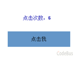
}运行结果
如下图所示,鼠标移动到按钮控件上方,按钮控件背景颜色变深;点击按钮控件,按钮控件背景颜色变得更深,标签控件会显示点击次数。
感谢你的阅读!祝你有所收获。
添加评论
取消回复